Industry: Creative Agency
Project: Brand Identity
Designed in collaboration with Acadia
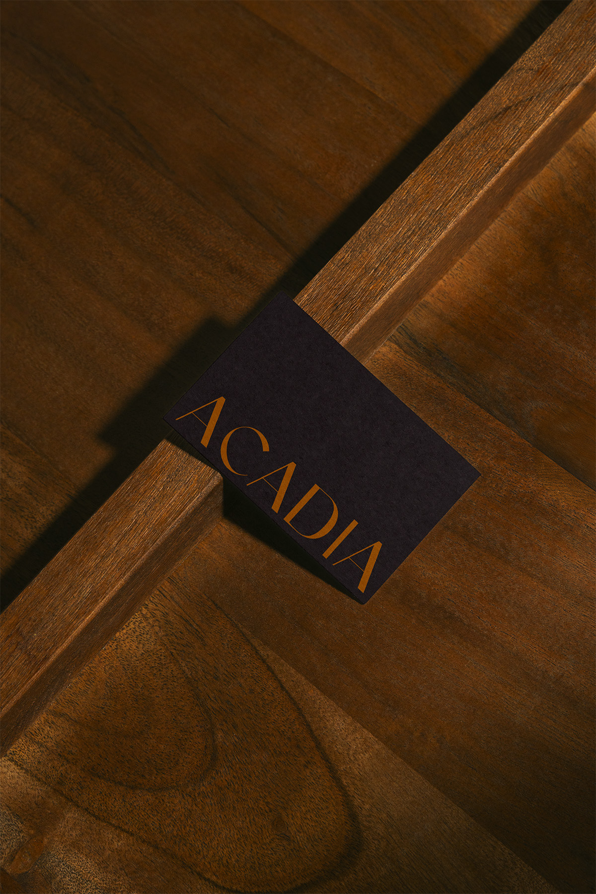
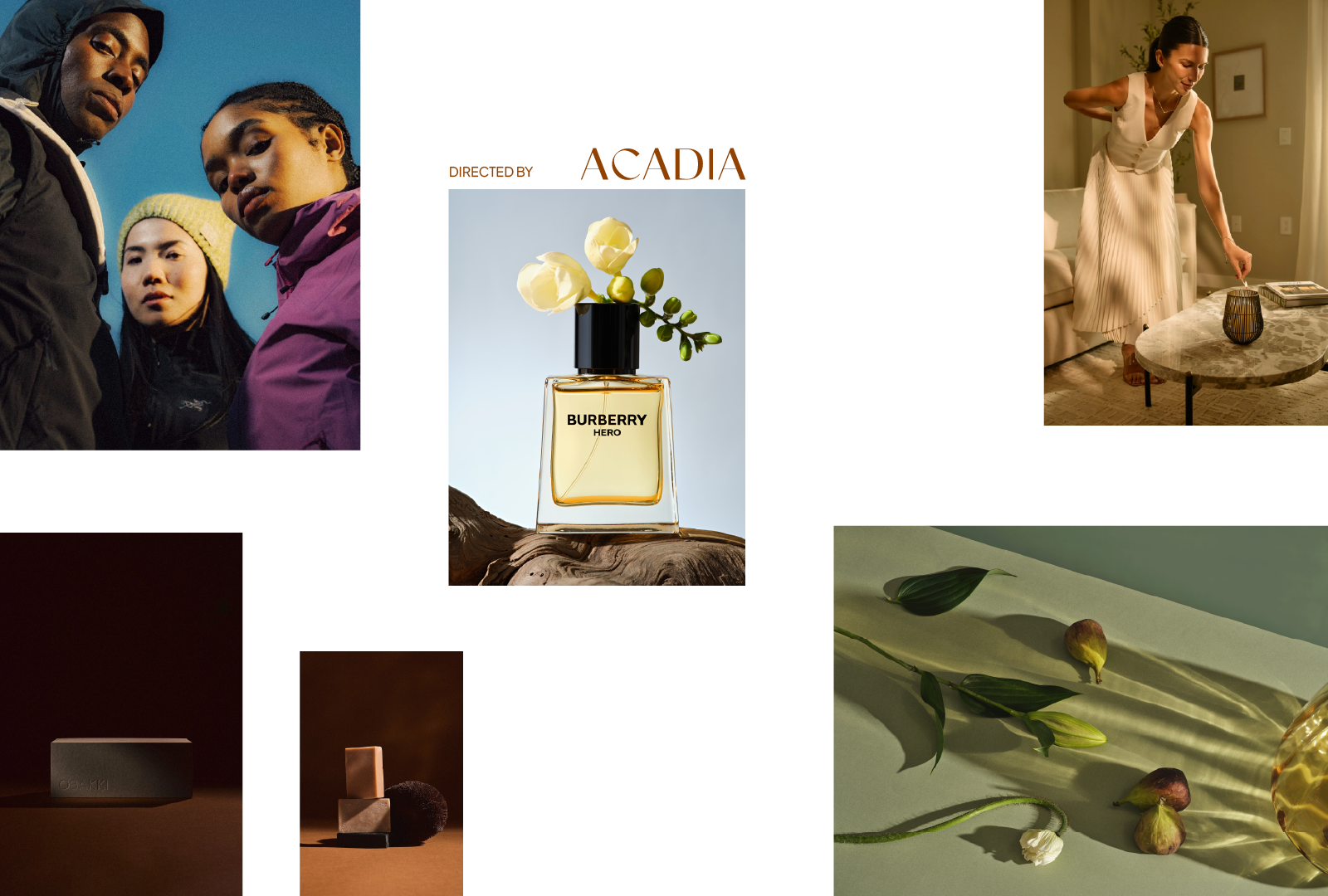
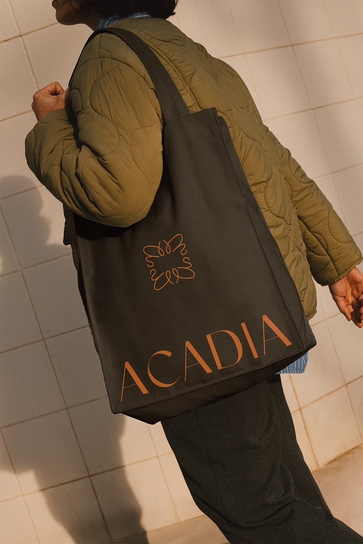
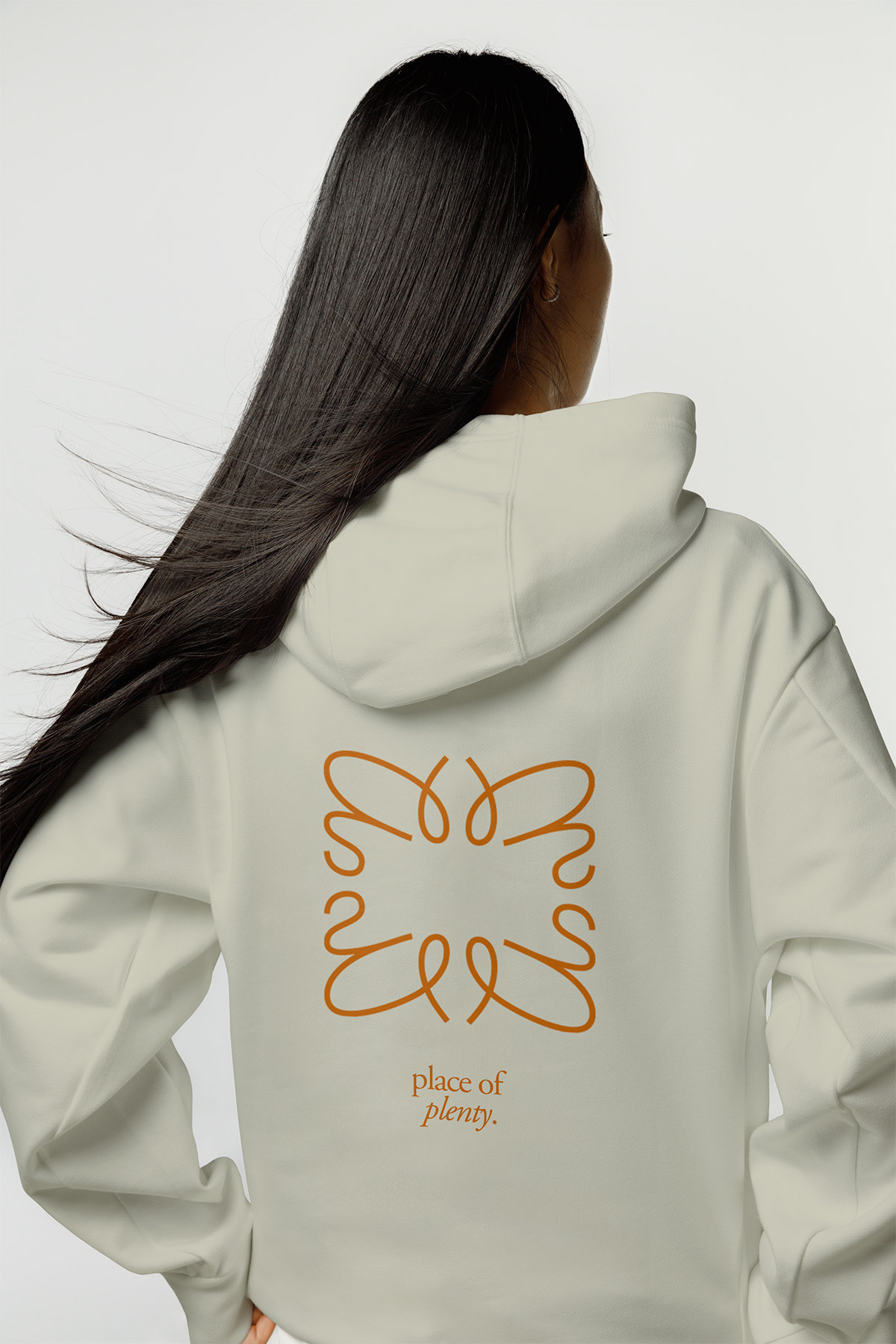
Acadia is a new creative marketing agency built on a single idea: a place of plenty. The goal was to give the agency a visual identity before it ever walked into a client meeting, one confident enough to compete with Vancouver's established players, without inheriting their coldness.
Typography leads the system. The perfect balance of serif warmth and sans-serif structure, is set oversized and editorial, closer to a magazine spread than a standard brand deck. Layouts break grid on purpose.
Colour stays deep and warm throughout, rich natural tones that feel grounded rather than trendy. Nothing here is loud. It doesn't need to be.
The voice matches the visual system: established and confident, but never elitist. In a Vancouver market full of agencies that feel judgy and closed-off, ACADIA reads as the room you're actually invited into.
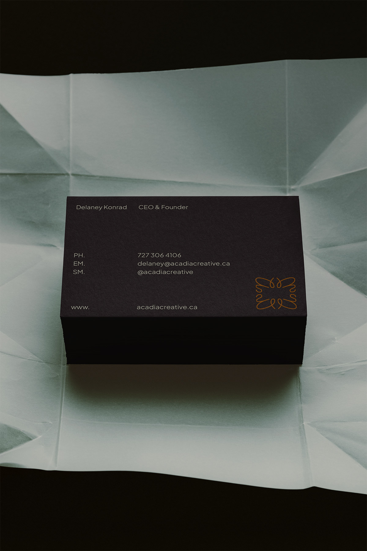
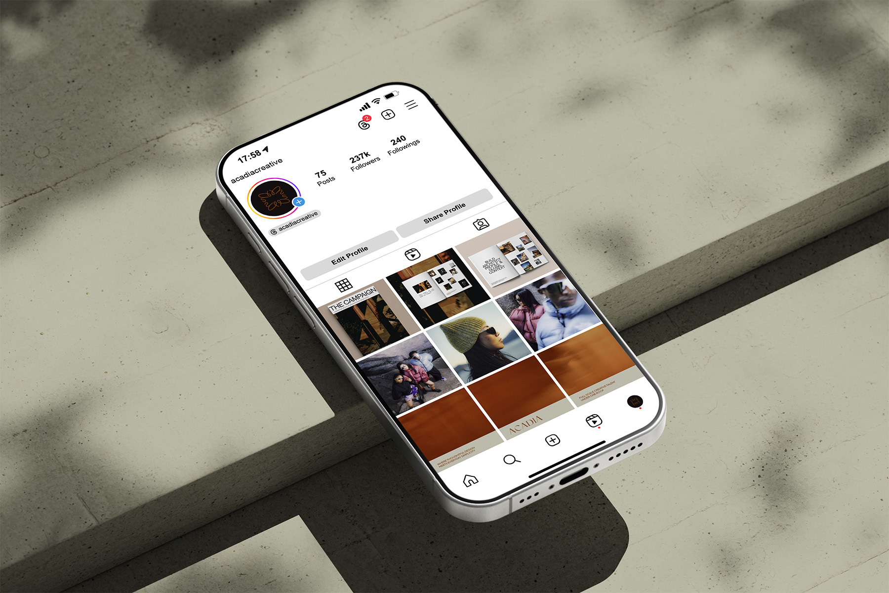
The identity extends across business cards, a full website concept, social presence, and internal merch, giving the agency a consistent point of view before a single client meeting.
Officially launched in July 2026.