Industry: Life Insurance & Financial Planning
Project: Rebranding
Designed in collaboration with Acadia
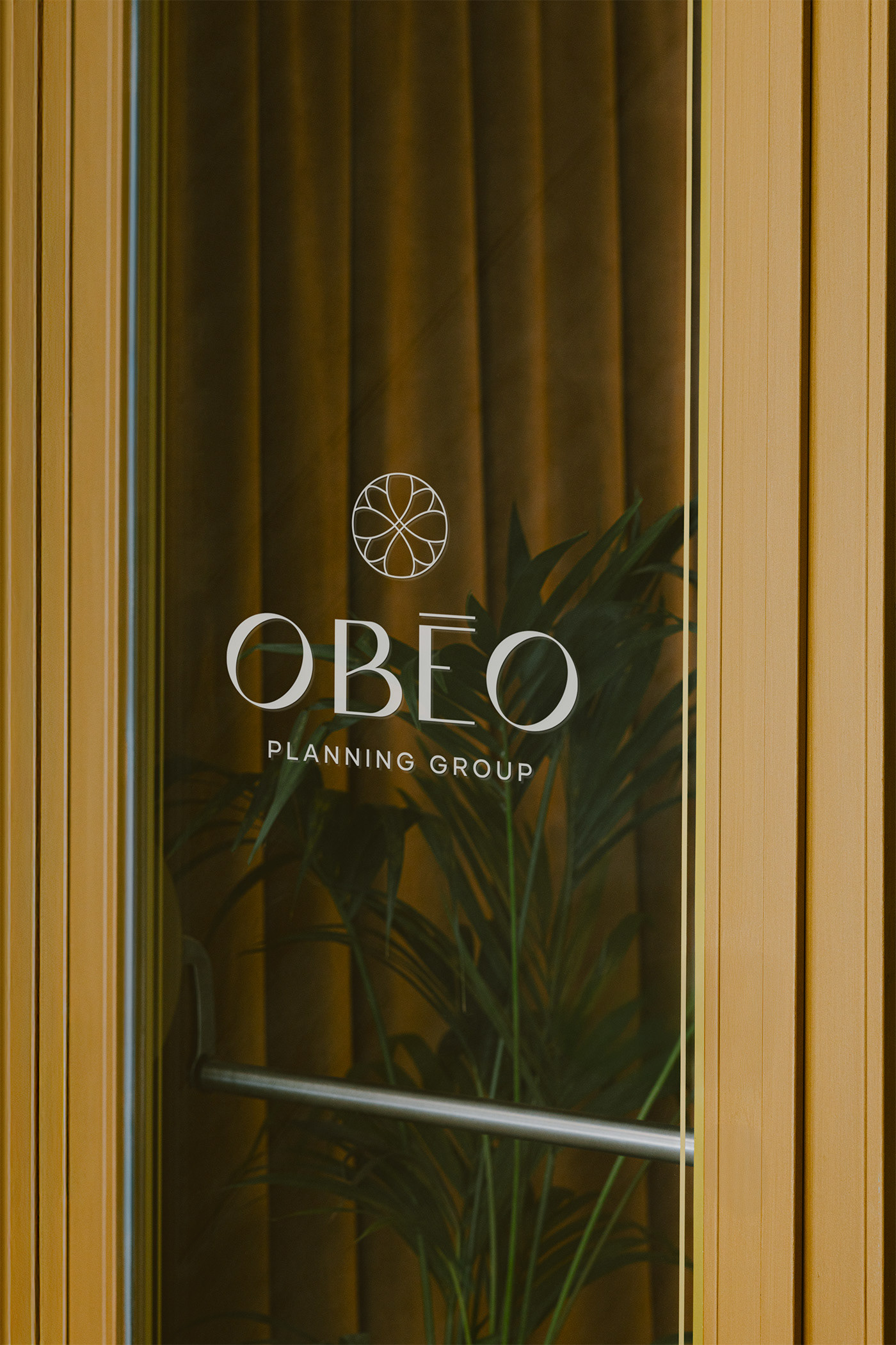
OBEO [ˈɔ.be.oː] — compass, to go towards, to attend to. The name is the brand's north star. OBEO's rebrand is built around a simple truth: financial planning was never about rigid products. It's about meeting people where they are and guiding them toward the future they're building, for themselves, their families, and their businesses.
The logo is an abstract emblem, its arms drawn from the form of a compass but rendered with a feminine, classy restraint. It was designed to hold weight, the kind of mark that feels trustworthy to a multi-million dollar client without ever tipping into cold or corporate.
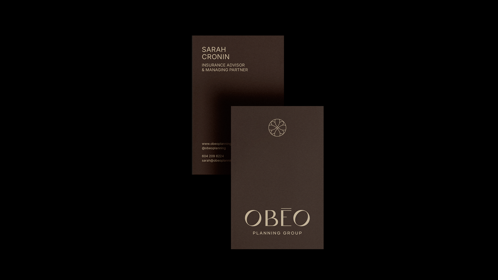
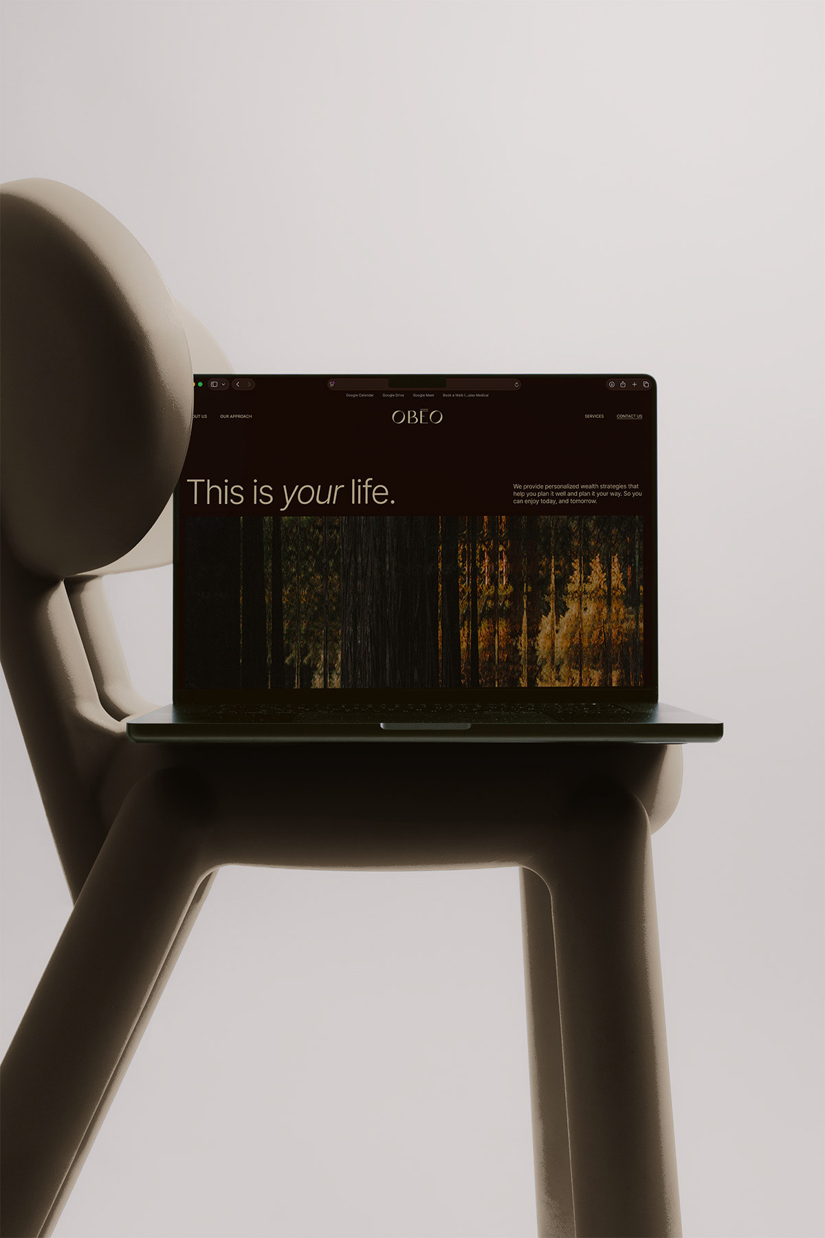
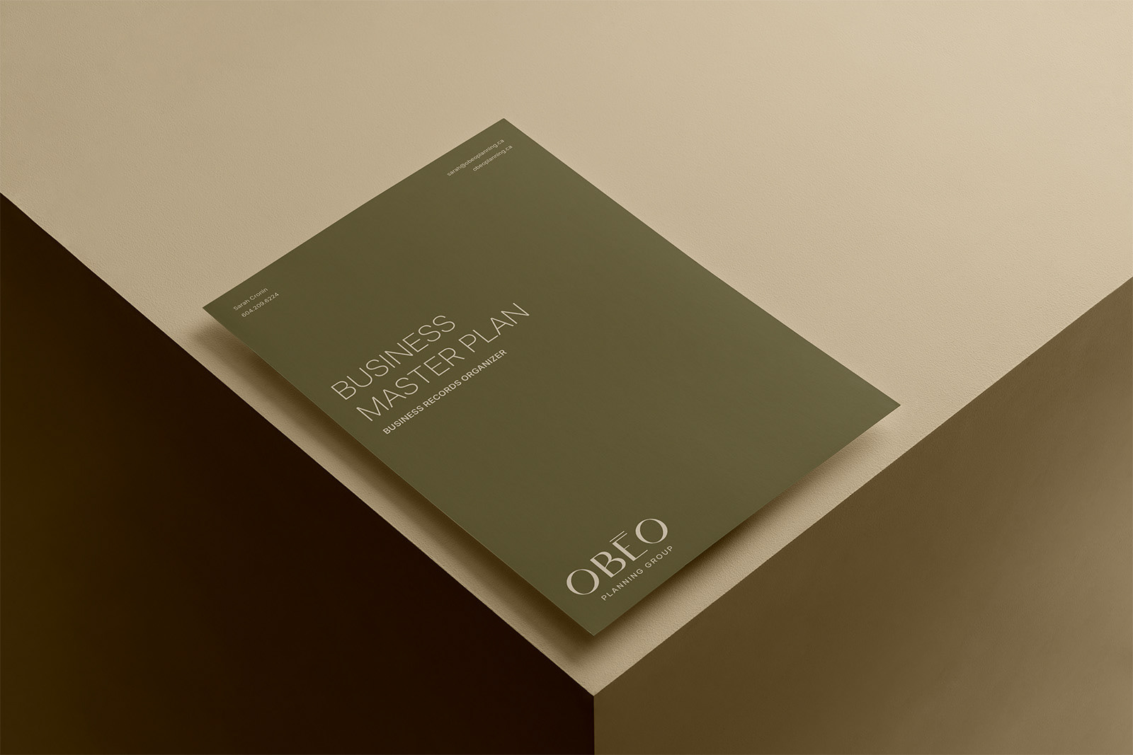
Colour draws from the Vancouver coastline where OBEO began: deep woods, sandy shoreline tones, natural and grounded rather than polished. It's a palette that feels like the coast, not a boardroom.
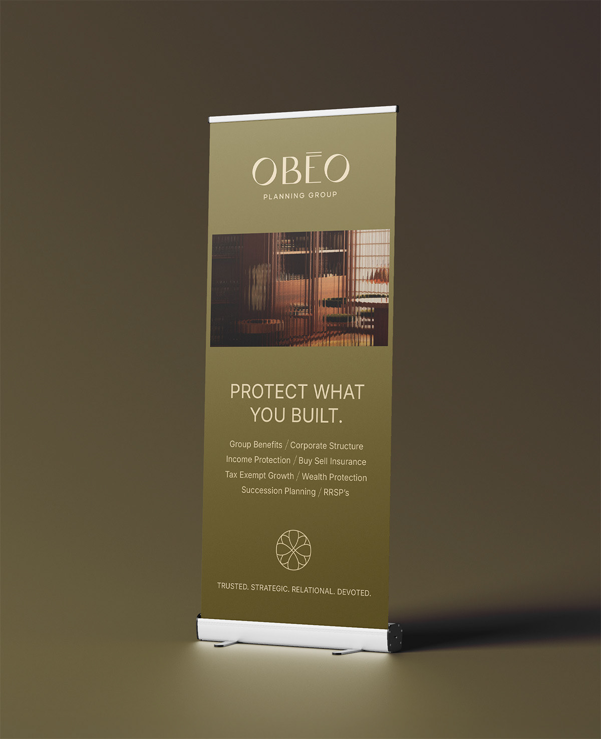
Every printed piece carries the same intention. Business cards, banners, and client plan folders are embossed, a small physical cue that says this was made for you, the same way each plan is built for the client holding it.
OBEO has been guiding clients since 2016. This rebrand, launched in January 2026, gives that decade of work a visual language as considered as the plans themselves.